museumblog

A place to publish notes on exhibitions and museums. More discussion of this kind of work seems useful. Let me know if you find this of value, or if you'd like to contribute.

Sunday, September 03, 2006

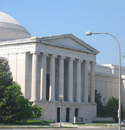
Washington, DC: National Portrait Gallery and Smithsonian American Art Museum

The building is breath-taking, the art is better than I remembered it, and the organization works, mostly. The Smithsonian spent a few hundred million dollars and six years on the project, and it shows. The architecture is crisp, the workmanship first-rate, the design quiet but solid.

I must admit I was dubious about the project from the start. The SAAM is not a strong collection, as art museums are usually judged. Within a mile or so, the National Gallery, the Phillips, and the Hirschorn have better art works in almost any given category. The NPG has a great collection of portraits, but few that would be considered masterpieces of art; it's a cross between a history museum and an art museum that more often than not partakes of the worst of each category. So both museums start with some real disadvantages.

But sometimes disadvantages can be turned to advantages. The staff of the museums put all those years the museum was shut to good purpose, arraying their collections in ways that show them well, the juxtapositions both within and between the museums producing some fine aesthetic and educational surprises.

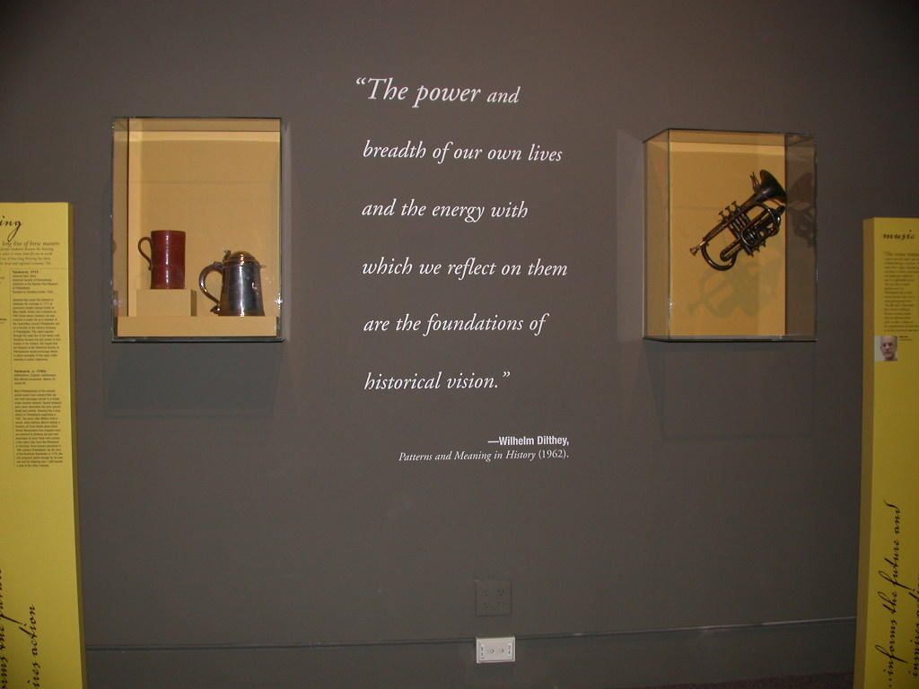
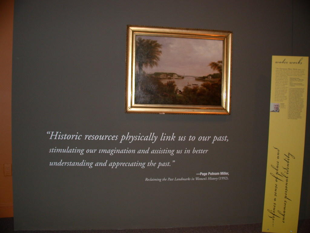
The SAAM has played to its strength: it's a comprehensive collection. That might be another way of saying that it has good and bad, mostly bad. But it also means that a visitor can get an overview of American art--not just what happens to be in fashion at the moment, but much that in other museums would be relegated to storage. And the museum plays to this strength, defining art broadly. It includes decorative arts--the fashion, lately (see the Boston MFA) but done very well here. (I would like to see more.) It includes folk art--some spectacular pieces. It includes popular sculpture pieces like the Roger's groups. It's an expansive collection. One strolls through decades, through schools of art, through regions. There are a variety of interpretive schemes, some more successful than others--I was much taken with "The American Experience" exhibit, art and words together--but less so with some of the interminable modern displays.

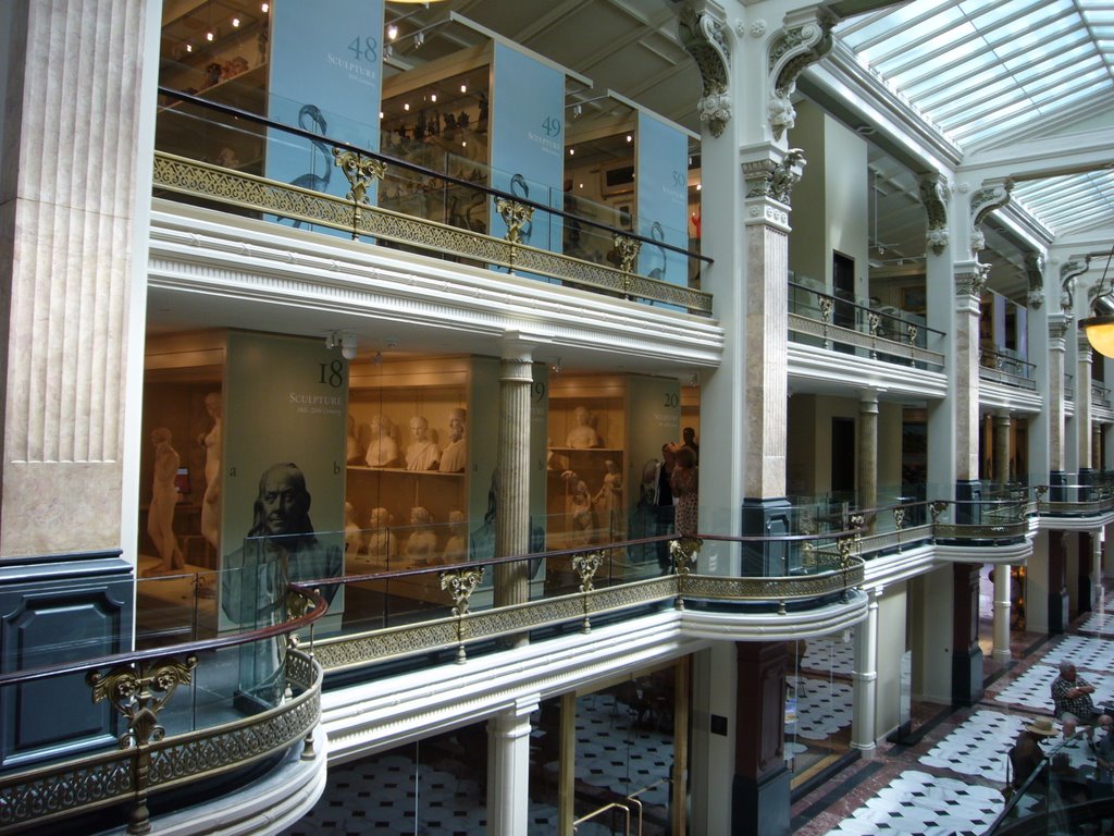
A conservation lab and an open storage area are exceptionally well done; the money that was spent on them shows. I'm usually dubious about open storage, for it is too often a chance for museums to avoid doing the work of explanation. But here, with a well-designed computer access system and a helpful person at the desk, it works. The SAAM, with its comprehensive collections, is in some ways open storage by nature; the Luce Center extends it nicely.

The NPG is working under more difficult constrains. It's a history museum that uses portraits to tell its stories, a rather limiting medium. The staff has done an admirable job of finding portraits to tell a diverse range of stories, and telling them in a range of ways--but it's still one damn person after another, with not much connecting tissue. The museum has borrowed a few objects to round out the story, which is nice; more would be better. Portraits are a limiting medium; the museum should take advantage of other artifacts to help tell the story. But given its constraints, it's done a good job, especially for those individuals where it goes beyond portraiture to biography. Walt Whitman is the best example: a pleasing variety of interpretative techniques, some well written labels, even a curator's personal statement. It's weak when it tries to go from portraiture to history, as in the Cold War exhibit. And it's weakest, of course, where portraits fail: Native Americans are shown from a white perspective, and the African American experience before 1840 or so is reduced to a few leaders.

But still, both museums are worth a visit, and the sum is greater than the parts. The NPG and the SAAM share the building in interesting ways; the visitor walks from one to another, at times not sure whether what you see is art, or portraiture, or both. (My favorite piece, a Nina Levy sculpture, left, shows the possibilities.)

But overall, the two museums work, at least for those who care about the subject. I doubt that either museum will attract much of a crowd--neither play to the masses, those with a general interest in art will stay on the mall, at the National Gallery or the other Smithsonian museums, and there's not much here to attract families. And indeed, after the first weekend, turnout has been disappointing.

New York, New York: “Transformed By The Light: The New York Night” at the Museum of the City of New York


The curator of “Transformed by the Light: was inspired by a difficult topic to produce a provocative, innovative exhibition, a sophisticated interpretation of the way that new technologies of lighting changed New York City. While not every element is successful, and not every visitor will enjoy it as much as I did, it’s a show no visitor will forget.

The exhibition breaks new ground with an interpretation of the way light changes the city. It does this not just in words, but in the display itself. Indeed, more than almost any other exhibition I’ve seen, this exhibit uses the artifacts and settings to make its historiographic points. That’s rare, and deserving of notice. Of course, the topic lends itself to exhibition; it’s about seeing, and being seen.

The exhibition is a series of recreated settings, times and places that were transformed by the application of new lighting technologies in the twentieth century. These settings span a remarkable range of sites and styles, from the bedroom, where light can chase away nightmares, to the city street, to the storefront window and the advertising sign. Some, like the street and the advertising sign, make superb use of rare and important original objects. Others, like the store window and the disco room, are recreations—sometimes successful, sometimes not.

“Transformed by the Light” brings ideas and artifacts together in a way that’s all too uncommon. There are significant collections on display in the exhibition, mostly worked into appropriate settings. A collection of lighting devices is shown in a store display. Some very early technologies are shown in a setting on offices. The displays of historical artifacts do not always work; design problems that occasionally make them hard to see, and in some cases, as with the lighting devices, the setting can’t carry the weight of the artifact display. The combination of museum labels and settings is hard to pull off, and “Transformed by the Light” is not always successful: words on the wall of a family living room, for example, look odd. Indeed, this might be the show’s most significant flaw: it doesn’t quite have the courage of its convictions to drop the didactic when it might, or to hide it better.

Still, when the conceit works, though, the effect is quite astonishing. The streetscape is breath-taking. The section on Broadway (below), with its array of historical stage lighting illuminating significant costumes, and showing off the show control for the exhibition, is brilliant. And even the disco room, more a display of the latest lighting technologies than a good historical setting—or, more accurately, a combination of the two—works surprisingly well.

A few other details about the design are worth noting:
• The exhibition has some of the best-written wall labels I’ve ever seen. They are short, pithy, provocative, easy to read and memorable: they are models of their kind.
• Some of the details of case design are quite poor, making artifacts inaccessible to visitors in a wheelchair, or to short visitors.
• The lighting effects in the exhibition were produced by ten volunteer lighting designers. Each was showing off, which in part explains the visual cacophony of the exhibition experience—but on the other hand, the exhibition shows a remarkable diversity of design styles; it’s never boring. And the curator and designer deserve kudos for taking advantage of the free design talent; the show would otherwise be beyond any museum’s budget.

Saturday, November 12, 2005

Washington, DC: The National Gallery of Art


I spent most of an afternoon at the National Gallery, delighting in its excellence. The exhibitions are thoughtfully designed, scholarly in content, with carefully selected art on display. Labels are clear and straightforward. No expense is spared in borrowing the right pieces, building exquisite displays, and taking care of them. The building is flawlessly maintained. Visitors seem enthralled by every exhibit. There’s nothing adventurous here, nothing new; it’s old-fashioned art history at its best.

Washington, DC: National Building Museum


The National Building Museum has always done remarkable exhibitions. They’re ambitious, make good use of a diverse range of artifacts and images, and take on interesting topics. Their exhibit budgets are fairly low, the production values fairly high. And, at least until fairly recently, there were many of them. The Building Museum always had something new. I used to wonder why they didn’t leave the exhibits up longer.

“Liquid Stone: New Architecture in Concrete” is a typical NBM exhibition. It’s less historical than some, but it combines architecture, building technology and history in the NBM way. (It’s weak on the work story, which is too bad: it would have been interesting to know about who does this work.) It also combines photographs, models, art installations, video, and materials in a typical NBM way. It’s unusual in its organization: structure, surface, sculptural form and the future, Bt that structure comes naturally out of the subject matter, and it works: the buildings used as examples clearly tell the story they’re supposed to.

It would have been nice to know more about some of the buildings. The photographs and the descriptions read like architectural magazines; it’s all about the designer. And even the designers don’t have much voice here; the curator’s voice is the only voice. I would like to see a bit more about the engineering, about the firms that moved these buildings from architectural scheme to concrete reality. What role do engineers play? How are decisions about materials made? It would be good, too, to know about what happened after the building was built. Was the design a success?

The design of the show is solid, its thick grey walls reflecting the solidity of its subject matter. The installations of concrete slabs and rebar add a nice touch. Materials in general were appropriate. There are many wonderful samples of concrete to touch. But there are others that cry out for touching with large “don’t touch labels” on them. Confusing.

Maintenance was only fair; the exhibit is showing its age. About 10 percent of the bulbs had burned out, and some video screens were blank. The silence of the show was remarkable; it made me realize how much I’ve come to expect (and enjoy) sound in exhibitions. Here, the only sound was the hum of video projectors. Another complaint: no place to sit in a long and detailed show. Why no concrete furniture?

The exhibit is sponsored by LaFarge, a concrete producer, and two of LaFarge’s products are featured. The display seemed appropriate, though. I don’t know whether competitors might complain about the choices.

“Liquid Stone” closes in January 2006; it’s worth a visit.

“Washington: City and Symbol,” on the other hand, is a design disaster. The most common failure of exhibition design is trying to jam too much into too small a space, and the “City and Symbol” shows why that’s bad. The first wall in the exhibit, only about 15 feet long, had more than 50 images, labels, descriptions, videos, and objects. And it only got worse from there. The show’s just too small for what it’s trying to do, and it’s trying to do too much. Juxtapositions are occasionally bizarre: the poorly defined sections blend together.

Defining the sections to break a story into is often the most difficult part of creating an exhibition, and “City and Symbol” shows what happens when that’s not done well. I couldn’t figure out the categories of the exhibit, and the examples in each category seemed chosen at random. Why should “Education, Religion and Recreation” be only about African Americans and Jews?

I didn’t spend much time in the show; it was too confusing, too busy. I did enjoy the raised maps and some touchable models—the maps were the best I’ve seen for the visually impaired. And a blind visitor wouldn’t have to worry about the confusion on the walls around him or her, either....

Sunday, August 28, 2005

Salem, Massachusetts: Peabody Essex Museum


Salem, Massachusetts: Peabody Essex Museum

The PEM is a remarkable place. It has all the attributes of a world-class museum: a spectacular new building by a famous architect; a collection with great depth and breadth; and thoughtful, beautifully designed and constructed exhibitions.

It’s also an odd museum. It bends categories, remixing art and natural history, old and new, and more. It’s an art museum with a vast range of superb artworks, yet without (this is a bit of an exaggeration) any work by an artist that 99 percent of its visitors might know. Its collection represents every continent—except Europe. It has a natural history collection and a collection of maritime apparatus.

The PEM is eccentric, eclectic, and electrifying. I’m not sure if it is the first 21st-century art museum, but its new way of combining art and culture suggests a new way of building a global museum for a global society.

History explains some of this. PEM is, its web site claims, America’s oldest continuously operating museum. It was founded by New England sea captains, leaders of the global economy of the 18th and 19th century. They collected art and artifacts from around the world.

A few years back, an infusion of new money reshaped the place. The old collections had new meaning for a new global world, and a new leadership took bold steps to invent a new kind of museum. The new PEM is—again from the web site-- a “place of meeting and global dialog,” a place of “art and culture,” a place that provides “a new set of tools and opportunities to focus more intently on the art, to see beyond objects to their makers, the culture, and the creative process.”

A daring and provocative idea. Does it work?

One way of answering this is by looking at the changes from the old PEM. Beyond the vast improvements in design, beyond the gorgeous installations: are there new ideas as well? Yes, but only in the details. Labels are better-written, addressing bigger and more interesting questions. The collections, especially the South Asian collections and Native American collections, have been expanded so that these cultures that were once only “history” are now vibrant and alive, their contemporary cultural traditions celebrated as much as their historic ones. This is an essential step in any new art museum, I believe.

But: The changes are, for the most part, within the old categories. Art is organized by country, or by culture. Boundaries and borders are respected in a way that art and culture did not, and does not, respect them. While there is some shaking up of the old categories, the PEM misses an opportunity that an adventurous museum with its range of collections could accomplish. It misses the chance to show the flow of ideas around the globe, to capture the currents of culture as it flows across national and cultural boundaries.

The Peabody Essex Museum is, as it claims, a global museum. It does not yet live up to its claim of being a museum of global dialog. But it has set its sights high, and in exactly the right place, to redefine the museum of art and culture for the new century.

Saturday, August 13, 2005

Philadelphia: Atwater Kent Museum: The Real Thing and Why it Matters.


If ever there was an exhibition by museum people for museum people, this is it. It’s an interesting question whether the reflexive turn in museums is a sign of strength or weakness. Are we doing exhibits that explain why we do exhibits because we think we know, or because we’re not sure. Are we telling visitors that museums are important because we are sure that they are, or because we are in a moment of uncertainty?

And do museums raise questions about voice and selection in this same moment because they are sure of the answers, or because we are not? It’s fashionable to say, “what do you think?” or “what would you have us collect?”. Are we doing this because we want our visitors’ opinions, or because we just want them to care about ours.

Are we at a moment where we’re secure enough to ask for help? Or are museums asking for input because we’re not sure of our standing to answer these questions?

The Atwater Kent Museum’s “Real Thing” is a beautifully-designed place to consider these issues. It redefines the “treasures” exhibition, displaying twenty-five interesting, important, provocative and challenging artifacts from Philadelphia’s history. Each of them is nicely displayed, flanked by a short label and some longer thoughts about the object from city notables, or from others with a point of view. The presentation is terrific: it’s clean, clear, some gorgeous colors, easily read.

And here’s what makes it a museum display for museum people, and especially for students of museums: behind many of the artifacts are quotations from a virtual syllabus of museum studies texts about why these artifacts are worth considering.

We’ve got David Lowenthal: “History in isolation is barren and lifeless; relics mean only what history and memory convey.” Page Putnam Miller: “Historic resources physically link us to our past, stimulating our imagination and assisting us in better understanding and appreciating the past.” James Traub: “It is, at bottom, a question of belief. Museums must start with the premise that visitors treasure the experience of seeing unique objects in a setting that deepens our understanding of them.” And a half-dozen more, all the good bits from the best museum-studies curriculum on the wall.

It worked for me, and I think museum students would get it. But I wonder if the juxtaposition of grand, often theoretical, words and sometimes unrelated objects makes the point to the general public. Gerda Lerner on selective memory (“Selective memory and the distorion of history have long been the powerful tool of oppressive regimes. It is worth noting that when subordinate groups have come to power they have tried to define and recover their history. This oft-repeated process testifies in its own way to the deeply felt need for a history of formerly oppressed peoples.”) makes sense next to objects relating to racial oppression, but some of the others seem less direct.

Still, the exhibit works. There are powerful objects next to thoughtful words. There’s space to move through the hall, to get some perspective. The design—and maybe it’s the large and elegantly-displayed text from those books—balances nicely the openness of the “let people other than curators talk” philosophy. The show doesn’t quite work as an introduction to Philadelphia history; it’s too episodic, with no narrative holding it together. That’s something that’s lost with the many-voices approach. But, for museum people, and for visitors who want to step back and consider what museums do, this show is a must-see.

Tuesday, August 02, 2005

Dearborn: Greenfield Village at The Henry Ford

Greenfield Village is an interesting problem. It’s a mismash of interesting buildings pretending to be a village. Henry Ford collected buildings he thought important and used them to recreate a fantasy village. An odd fantasy—a good part of it is pre-industrial, which is what one would think he would do; but there are also some serious industrial buildings, as well as the Edison “invention factories”. New buildings have been added, too, over the years, reflecting the layers of ideas of generations of curators.

Yet another new layer has been added. There’s a phrase in the business: FDGs—“former Disney guys.” And while I don’t know who redid the Village, it has all the earmarks of FDG work. That’s good and bad—for the most part, good. The Village is much livelier than the last time I was there, much more interesting. On the other hand, some elements are way too Disneyesque.

The good first. You can do things now. This makes an enormous difference. For $3 you can ride in a Model T. (I paid the $3, and got more than my money’s worth—not only a good lesson in how the pedals work, but a great story about Ford’s centennial Model T replicas. For more money, you can take driving lessons. I’d sign up for that, too.) You can ride on the train or a bus, too.

You can also run some of the machines. For another three bucks you can run a turret lathe. I didn’t do this—kids were waiting in line—but it turns out to be much more educational to watch someone learn how to do it than to watch a bored docent do it for the hundredth time. Definitely something for other museums to learn from.

They’ve gone a bit far with the crafts in some areas. What should be industrial processes have been turned into crafts. I can see why—it’s fun, they can sell lessons and sell products—but it makes for a distorted message about historical production.

The FDGs have also cleaned the place up a bit too much. Some beautiful plantings around the machine shop. The lake has some fine water plants. Now, it was never accurate before, and it’s never pretended to be an industrial town... but the mixed signals are louder and more confusing than before.

The one part of the FDG work that I found objectionable was the parade. Anyone who’s been to Disneyworld knows about the parades—the whole place is set up around them. Well, Greenfield Village now has a Disney parade. The entertainers, the cars, the bicycles, singing and dancing their way through the streets.... I didn’t get there to see the beginning, so I’m not sure how they introduced it—but it seems quite out of place...

Overall, though: the place looks better than it ever has. There’s more to do, there’s more depth. The balance still needs work, but it’s headed in the right direction.